
The Challenge
Despite pioneering the yellow nonwoven roll and holding a dominant technical position in the category, NCCM’s visual identity didn’t reflect the premium, modern company they have become. As they expanded across sectors — steel, automotive, OEM — the gap was widening.
Further, as the company grew, the founders wanted to ensure that the founding principles and the company values were instilled in all employees.
NCCM RE-BRANDING campaign

The Approach
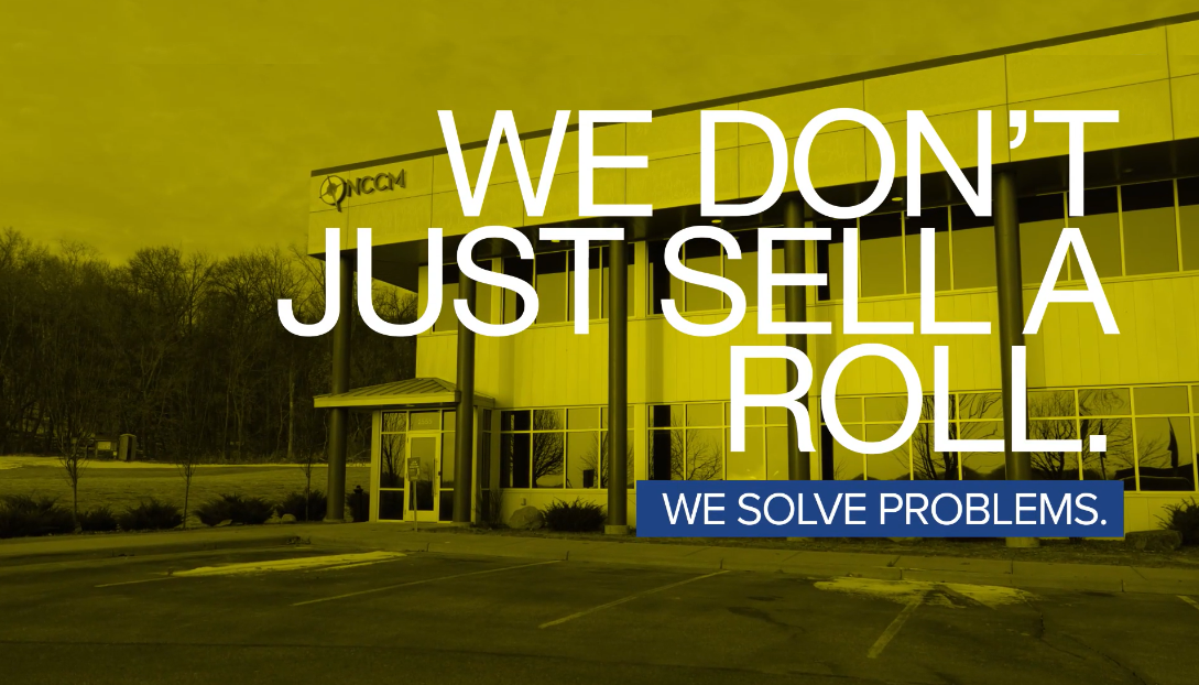
The insight: NCCM already “owned” yellow. Our goal was to make that ownership unmistakable and impossible to ignore.
We immersed ourselves in NCCM’s business, products, markets, and competitive landscape. We defined the strategic pillars that would anchor every creative decision:
Own yellow — make it the defining, unmistakable NCCM signature
Lead with technical authority: engineered solutions, not just products
Balance industrial confidence with approachability and purpose
Infuse the founder’s faith and values into all messaging
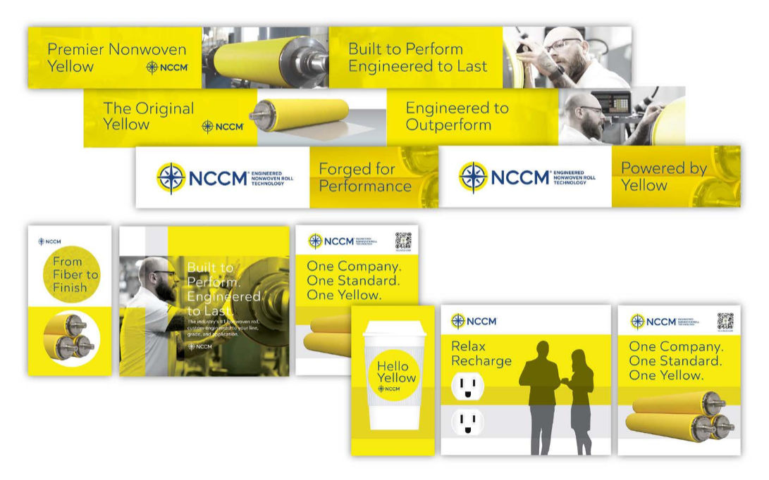
The new identity is anchored by a compass/cross icon — the North Star for NCCM — symbolizing direction, precision, and purpose.
Compass/Cross icon: the guiding mark
Lock-up with “Engineered Nonwoven Roll Technology” descriptor
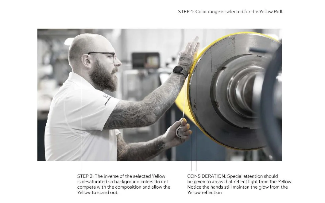
Developed a series of taglines, a color system, typography, photo treatment and icons

Vectra Campaign Video

Vectra 15 second Cutdown

Vectra 6 second Cutdown
Deliverables
Fully refreshed NCCM brand that was built on the principles and values of the founders (reflected in the cross/compass) and yellow (meaningful to the marketplace and telegraphed quality).
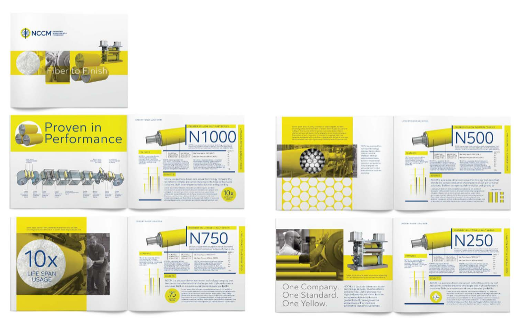
We developed a new trade show booth and collateral system as part of the launch.
A video concepted, shot and edited by C+S, in a podcast (modern) format to capture the history of the company, the values and vision of the founders and re-commitment to yellow.
C+S coordinated the shoot, edited and incorporated graphics into the video to create a compelling story for current and future employees, customers and prospects.
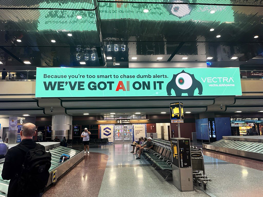
Large digital advertisement in an airport showing a stylized robot with a red eye and a message about AI and alerts.

Black t-shirt with Avengers Assemble design featuring green monsters and circular target symbols in red and white.
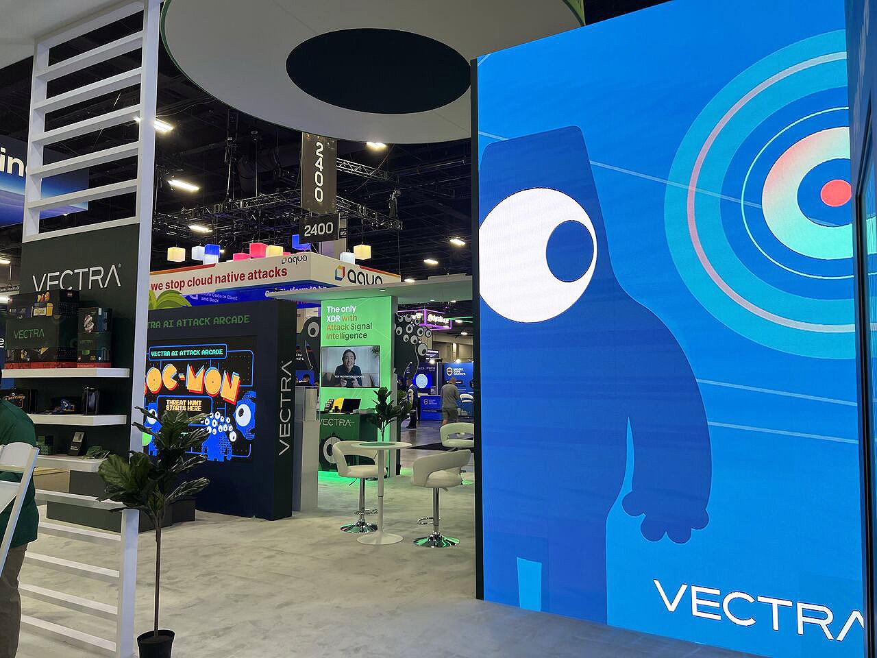
At a tech conference, a large vertical digital display features a blue cartoon robot with a big eye, holding a stick with a circular target in the background, and the word 'VECTRA' at the bottom right.