
Lotus Pharmacy blooms in to its own
When Lotus Pharmacy came to us to refresh the website to better reflect their mission that is driving by purpose.
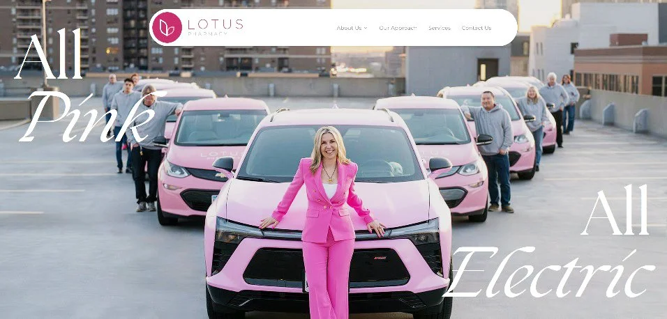
Their newly relaunched site, lotuspharmacy.com, is more than a digital facelift. It’s a statement. A woman-owned, mission-built pharmacy that’s rewriting the rules of pharmaceutical care with clarity, compassion, and consistency. From unit-dose packaging to 24/7 med access, EHR integration, and vaccination clinics, Lotus is built to support caregivers, communities, and individuals across the continuum of care.
So how did CRASH+SUES plug in? We started by extending the brand’s visual language—refining logo treatments, recommending typefaces that speak with warmth and build out a graphic system that reflects the brand vision and mission. We curated a photo library that reflects real care environments, not stock clichés. And we helped shape content that captures the heart of Lotus: uplifting, transparent, and tech-savvy.
Lotus isn’t a chain. It’s not a franchise. It’s the big-box alternative with a beating heart. And we made sure every pixel reflects that.
From brand to bandwidth, CRASH+SUES helped Lotus Pharmacy rise to meet the light!